This circa 1915 Edwardian house in Seddon was classically beautiful, but suffering problems typical of its age.
‘The existing house was uninsulated, and there were cracks creeping up the walls from years of movement from the bad soil conditions typical of the inner west of Melbourne. It also had a tired lean-to with kitchen, living, and bathroom at the rear,’ says Yvonne Meng, director of Circle Studio Architects.
‘The ceilings here were low, the spaces were dark, and it did not make the most of the north-facing aspect to the backyard.’
These issues called for a complete structural upgrade of the Melbourne home.
The first order of business — adding a concrete slab to the entire house to ensure structural integrity, better thermal mass, and longevity.
‘Because the external walls needed to stay and there was limited space for equipment on site, the walls were propped, and the footings were dug by hand from the inside and the concrete was poured around the existing walls,’ says Yvonne.
The existing walls were also completely stripped back, insulated, and windows double glazed.
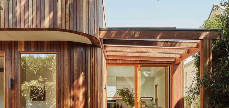
The next order of works was replacing the home’s lean-to with a more comfortable two-storey addition.
Yvonne explains the intention, ‘The client mostly liked the location of the kitchen and bathroom in the old lean-to, but due to the age and quality of the space, it did not provide the lightness and flow they wanted.
‘In the new extension, we kept the location of the kitchen and wet areas in the same area to minimise the need to move services, but extended a living area into the backyard for better connection to outside.’
Interior curves soften the look of the addition and allow spaces to flow onto each other on the ground floor without being strictly ‘open plan.’
‘This also meant no sharp edges as you move between the living zones,’ says Yvonne.
The same treatment was applied to the extension exterior, which gently curves to complement the original, heritage roofline.
‘We didn’t want to simply put a ‘box’ on top of the existing home as it would have been potentially jarring and bulky from the street,’ says Amber Laing, director of Circle Studio Architects.
The interior palette of the addition is crisp and pared back. White walls accentuate the curved forms in the walls and ceiling, while timber trims around skirtings, doors, joinery handles, shelves and ceiling rafters add warmth.
‘These types of rafters are usually used for bullnose verandahs, but they were scaled up for this project to fit the shape of the roof,’ says Amber of the ceiling rafters. ‘Many people who walked through the space commented on how unexpected they were. Some even described it as giving “nautical vibes.”
Full-height sliding doors visually and physically connect the home with the outdoors, and the highlight windows give glimpses into the sky and treeline.
‘When you are sitting on the first-floor deck, you are nestled in the tree line and the top of the cactus peeks out from the east,’ says Amber.
‘Almost everyone hit their head on the cereus catcus at some point during construction. (It hurt).’
Old doors, architraves, and pendants were reused in the existing part of the home to retain the character of the house, and new blackbutt timber flooring was laid throughout to blend old and new.
The impact of these collective changes is comprehensive, but it’s the smaller details of the project that Circle Studio appreciate the most, such as the bookcase tucked in next to the stairwell.
‘There was a leftover space created by a gutter above connecting the old and new roofs, which was the perfect width for a bookcase. The clients love books, so instead of hiding in the gap, we designed shelves to align with the stairs and create one integrated piece of joinery,’ says Amber.
The home is now structurally sound and fit for purpose, incorporating fine details throughout to excite and delight.

